
JOYOUNG EXPERIENCE
A joyful sharing online shopping experience to increase conversion rate
UI/UX Designer, User Research, Visual Design, Figma Prototype, Wireframe
Role:
Team:
PM, Engineer, Researcher, Joyoung Global Marketing Team
Tools:
Figma, Photoshop
Time:
07 - 09. 2022
Context
Our client, Joyoung, the third largest appliance brand in china, was trying to build an online shopping experience to expand into the US and European markets. The goal is to create a joyful sharing online shopping experience to help Joyoung present a clear brand image and achieve product conversion in the European and American markets.
PROBLEM
PROBLEM
I want to add and share my favorite songs to the party music playlist.
DESIGN FOR UNDERSTANDABLE
The Joyoung experience is designed to help users explore products and brand in a scenario-based context and understandable information hierarchy. Eventually help the brand present a clear image and increase product conversion rate in US and European markets.


Target User
Female, Middle class and enjoy sharing and cooking with friends and family. Enjoy online shopping.
User Problem
Inefficient workflows to browse product and brand.
Lack effective information to help user decision making.
Success Metric
Number of conversions and user complete their goal quickly and easily.
Finding and view content quickly. Trust brand image.

CHALLENGE
Create a joyful sharing online shopping experience to better help Joyoung increase product sales and present a clear brand image in the European and US markets
UNDERSTAND THE PROBLEM

Reading a bunch of research reports and invited colleagues in different roles to critique the current site design, and I got a lot of findings and questions.

Collaborate with marketing team to define brand positioning and persona
I learned from different perspective with my stakeholders and understanding brand and target user


What are their critical user journeys
I started with user quotes and research conclusions to find different use cases. Then I summarized these user needs into 3 main key user journeys.

What are their pain point now
With all research data, I found that the problems could be summarized into 2 key pain points.
Inefficient workflows to browse product and brand.
Lack effective information to help user decision making.
With this question in mind, I started...

WITH THESE RESEARCH,
HOW COULD I DESIGN
THIS JOYOUNG EXPERIENCE?
Analyze current user flow and brainstorm
Before getting my hands dirty to create mocks, I analyzed current user flows and invite stakeholders to design critique and brainstorm. I ideate a bunch of design ideas to improve the experience in different steps in the current flow.


Idea prioritization
I try to prioritization them , based on this metric and summarized the promising ideas into a high-level solution.

HOW MIGHT WE...

Information architecture
With these design focuses, I tried to organize the information with intuitive logics to provide easy and understandable hierarchy for users. We explored different hierarchies and eventually decided the information display from high level to actionable by discussion with our team. This logic guided the design of the following interface.

TIME AND CONTENT
But due to time constraints, we had to narrow down the scope and focus on a few key pages for now.
Let's see where I got after this bunch of iterations.
Main interfaces - Joyoung experience
Provide an easier-to-understand hierarchy from products to scenarios to help users explore products and get cooking inspiration. Use scenarios to highlight product categories and show how our products inspire user's life

Homepage
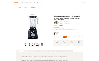
Product page
Community page
Recipes page

Product
Scenario

Categories
Detailed

General
Relevant

Popular
Customerize

HOW DO I TREAT
IMPORTANT CONCERNS
AND VALIDATE THE DESIGN?
Important concerns from users and stakeholders
During this iteration, I actually provided a lot of design options, and I got some important feedback from our stakeholders.
Unclear information hierarchy for users.
Users may not feel very clear and insightful at a glance.
Product should be presented in a more converting way.
How could we make understandable hierarchy for user?
We did some important iterations, such as how we make understandable hierarchy for users on the homepage, moving from a brand-to-product logic to a scenarios-to-product logic to help users get into familiar scenarios and explore the product and brand image.


How we can help user understand our categories better?
Clear titles + Image + Comments. I worked with our UX writers on a new way to describe the grouping approach for the collection pages

How can we create sites in a more converting way?
We tried to provide the right information at the right time to help users make decisions, for example unboxing videos. From a research perspective, it was inconvenient for users to have to switch to other platforms to search product information. Our solution was to let users explore the unboxing video on the product page.

USER TESTING WITH FIGMA PROTOTYPE
Then gather all the page into user testing with figma prototype. Test about visual concepts, understand informationarchitecture, and how user navigate and across screens based on how content is displayed
Worked with our UX researcher on the plan and got a lot of feedback and suggestions.

Testing result
Learnability problems of product information and brand image (Again, I iterated )
-
Home page hierarchy (picture, index, etc.) are not so understandable at the first glance.
-
Users felt the expansion view of product cards is not intuitive.
-
Users were confused how we sort the content.
Distracting Visual Details (Again, I iterated )
-
Too many action buttons.
Unclear checkout flow (Next project )
-
Users felt that product information are understandable, rather checkout flow is not so clear so far.
Improvement
How could we make product hierarchy more understandable? ( homepage )
More understandable hierarchy, from the product to the scenario level. The reason is that users usually come with a clear goal of exploring the product on our site. Use scenarios to highlight product categories and add product review videos to help users dig deeper into the product.

How could we make product hierarchy more understandable? ( Collection page )
Clear context combine with image to provide clear instructions for user

How could we make product hierarchy more understandable? ( Product page )
Recommendation a right product at right time. After browsing all product information, show similar product recommendations to the user.

Keep Iteration
Learnability problems of product information and brand image (Again, I iterated )
-
Home page hierarchy (picture, index, etc.) are not so understandable at the first glance.
-
Users felt the expansion view of product cards is not intuitive.
-
Users were confused how we sort the content.
Distracting Visual Details (Again, I iterated )
-
Too many action buttons.
Unclear checkout flow (We could do more researches about this )
-
Users felt that product information are understandable, rather checkout flow is not so clear so far.

Reflection
Think from Business Side
Think from different perspectives and keep our goal in mind.
Understand the Constraints
Based on the limited recourse and time. We need to balance the design and technical issues.
There’s Always a Better Solution There
Embrace complexity and ambiguity, build empathy on users, but also stake holders.
Next steps
More Research/Testing
Prepare artifacts for a more formal usability testing to validate design and use case
Iterate the design based on testing/research result
Increase Visualibllity
Present to different Eng/PM groups and get feedback
Sell the vision and get people excited
Phasing Plans
Work with Engs and PMs to develop a feasible phasing plan
Align the design to brand higher missions and envision a future development path